A character that actually looks like you
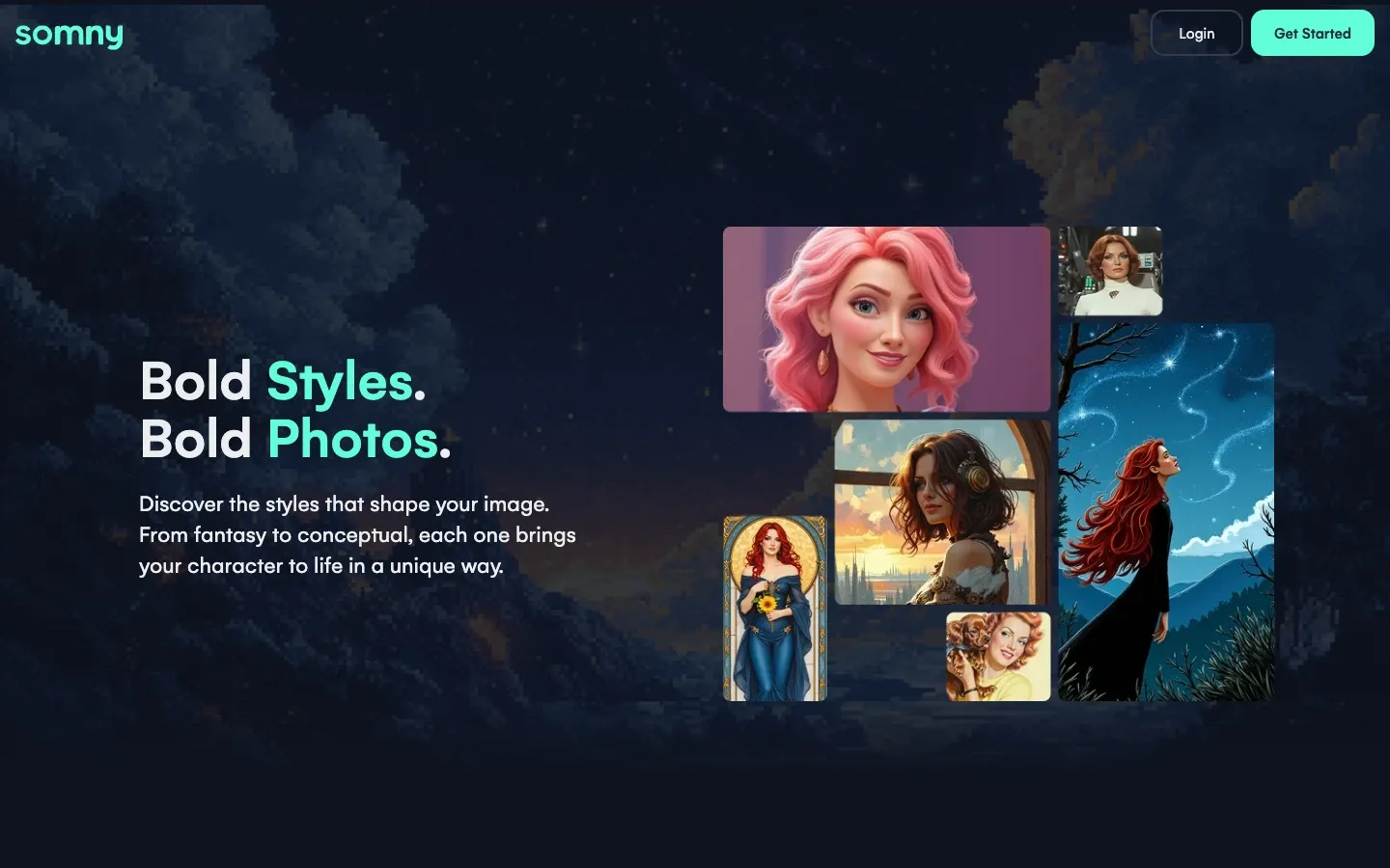
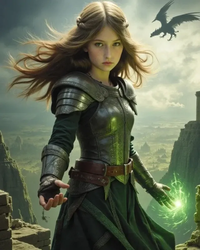
Somny turns a handful of someone's photos into a character you can put in any scene you can describe: you, your family, even the dog. I named it, designed it, and built the brand and the marketing around it.
Everyone else gave you back a stranger
Apps that promise to put you in a costume mostly hand back someone who only half looks like you. The face drifts. You notice straight away, because it is your own face.
Somny settles the person first. You build a character out of your own photos once, and every image after that is drawn from it, so the likeness holds across a hundred different scenes.
Built & Animated by hand in After Effects. Not AI Generated.
Put the character in the sentence
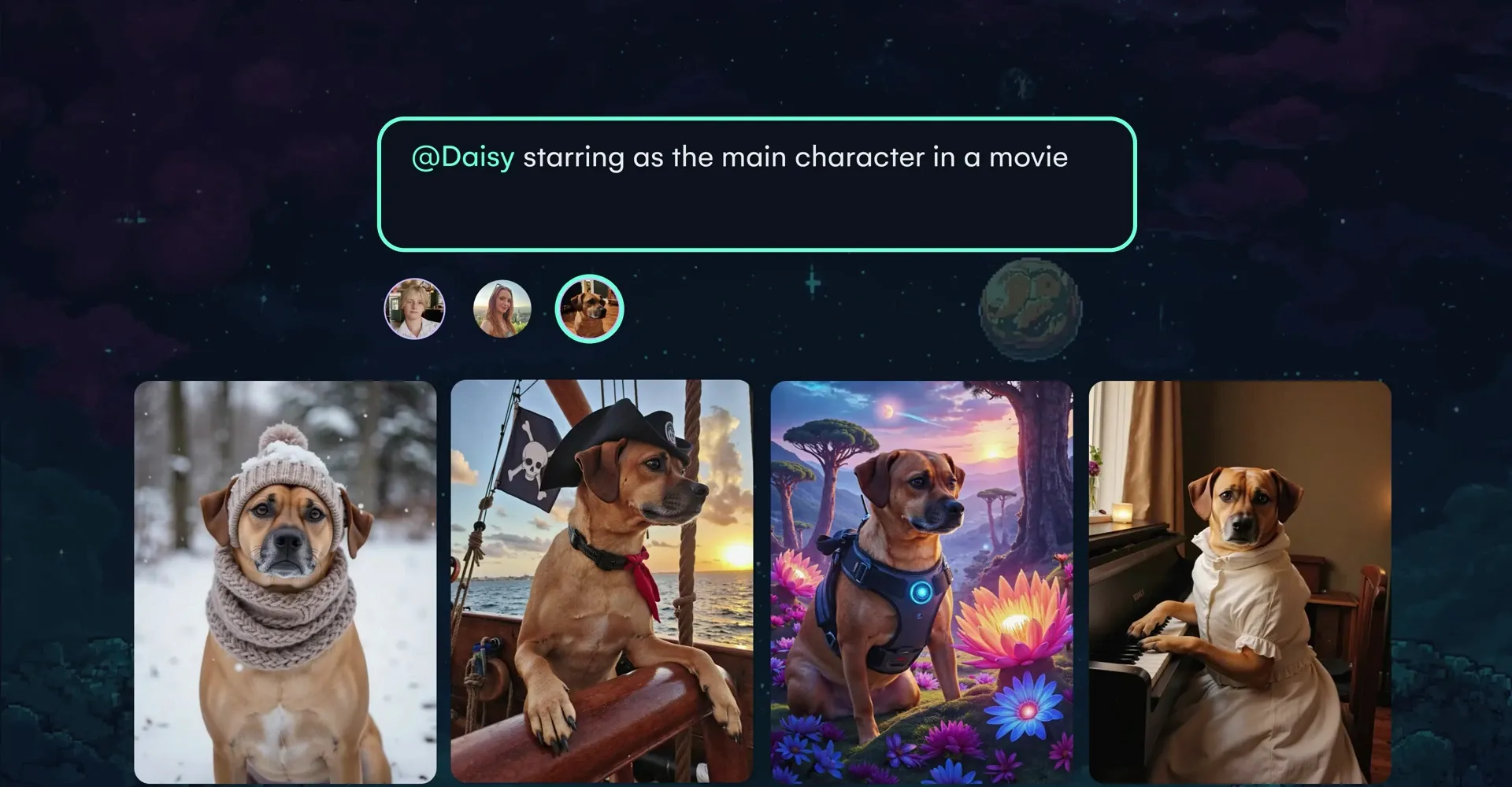
Choosing who the picture is of could have been a field above the prompt, the way a settings form would do it. I put it inside the sentence instead, as an @ mention, because what someone is composing is a single thought and splitting it across two controls makes them assemble it twice. The row underneath swaps who the sentence is about, and the sentence survives the swap.
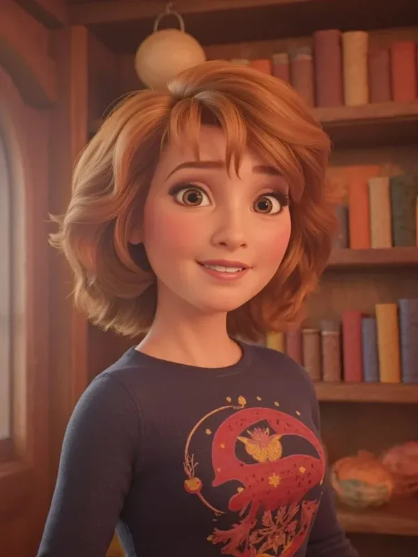
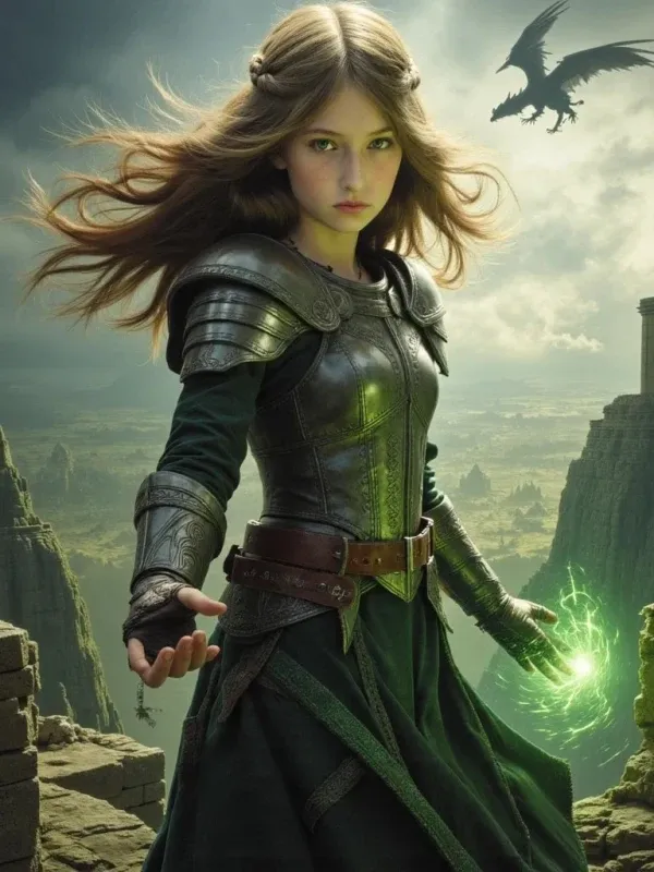
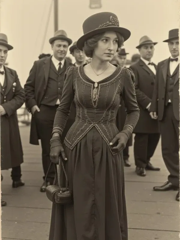
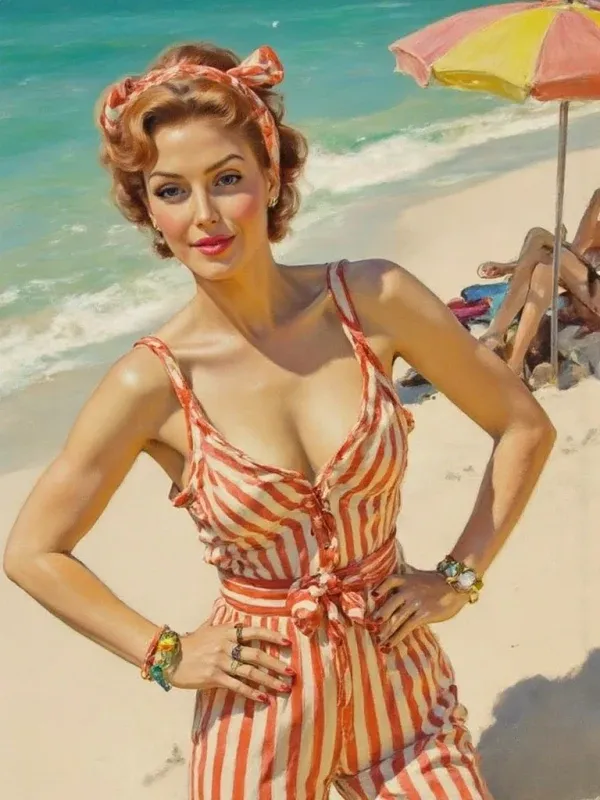
Twelve named styles, not a slider. People choose a look, they don’t tune one.
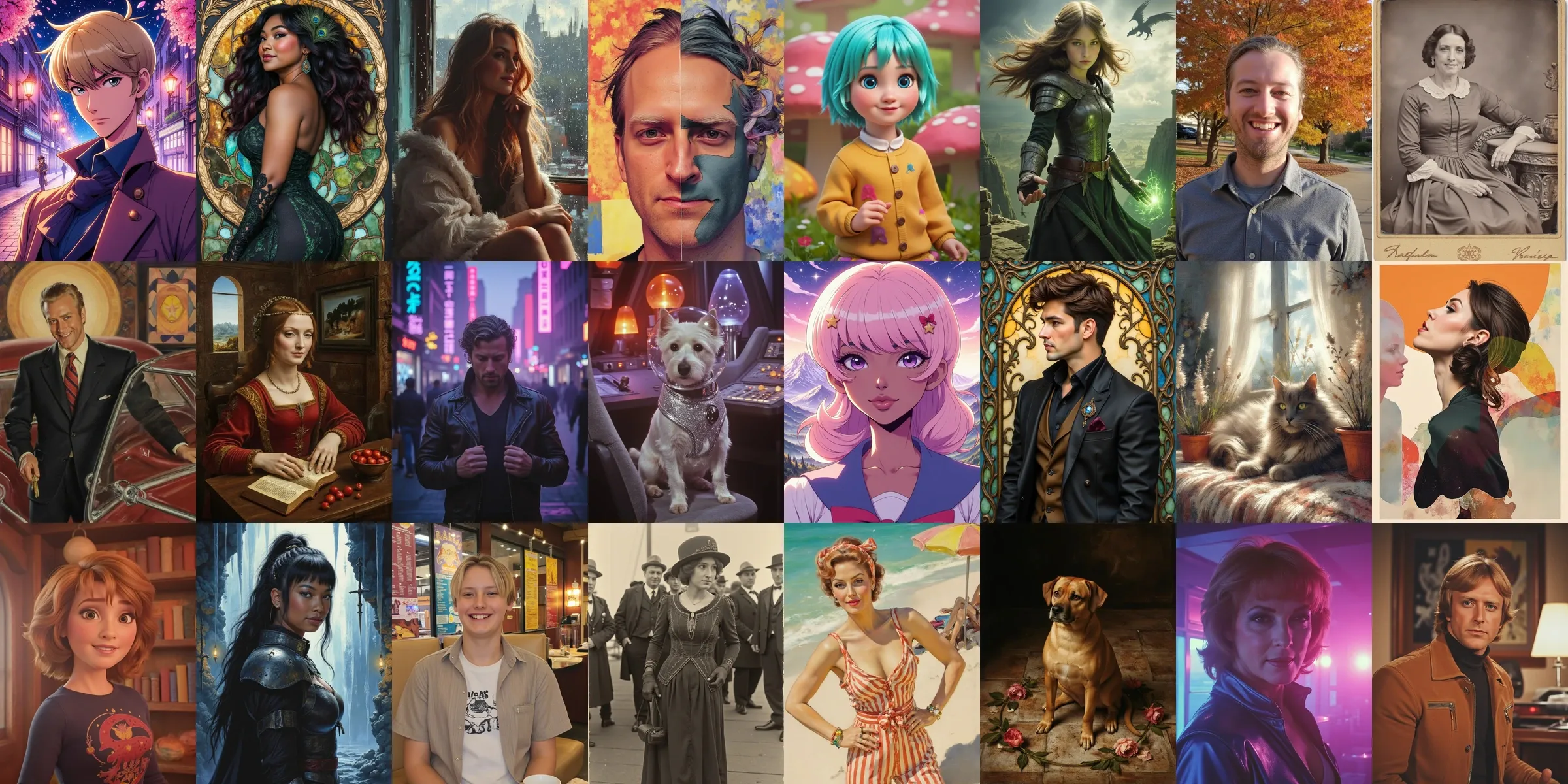
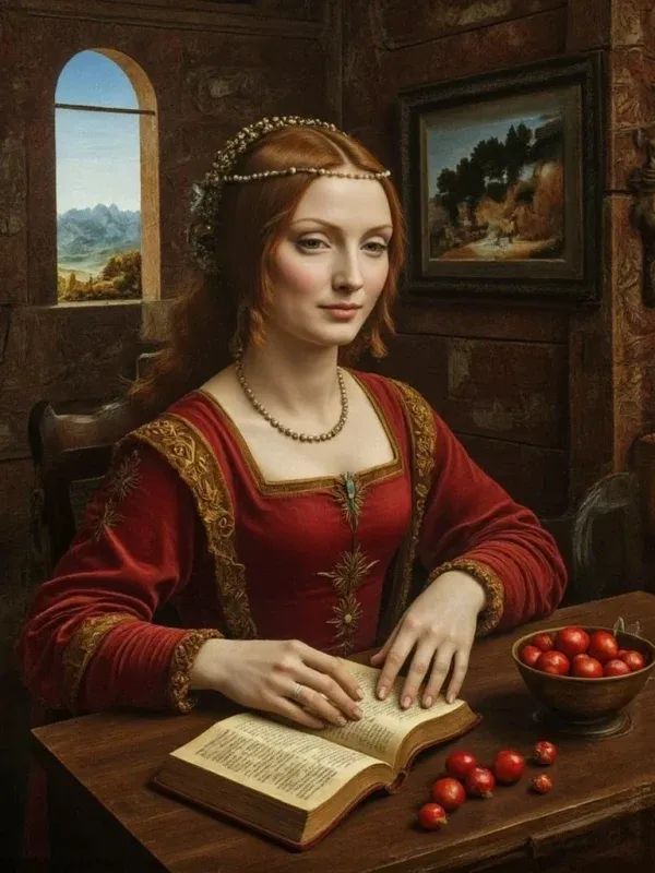
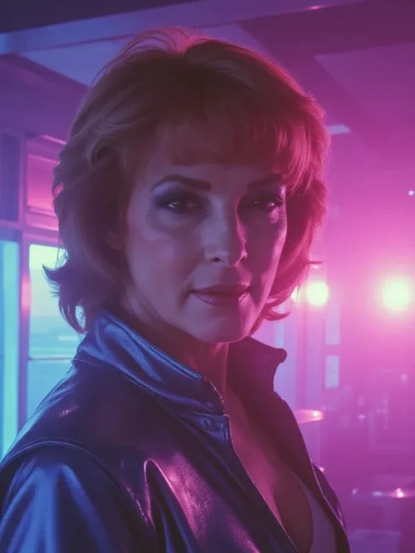
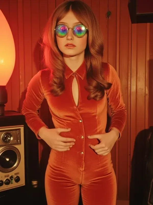
Designed twelve looks people can name
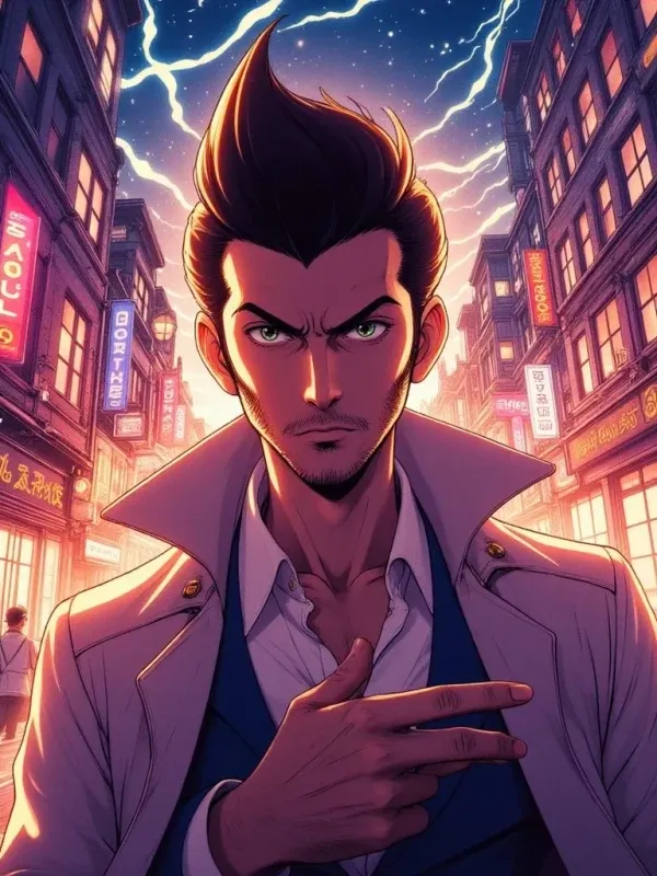
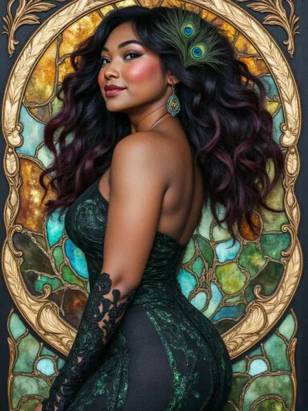
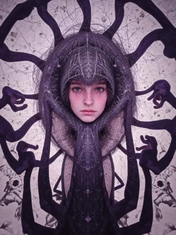
Each style is a visual language rather than a filter: its own palette, lighting, framing and subject vocabulary, tuned so the same character still reads as the same person inside it. I built them as named looks because someone browsing wants to point at one, not describe one, and a slider offers a thousand positions and no opinion.


Named it, drew the mark, set the palette
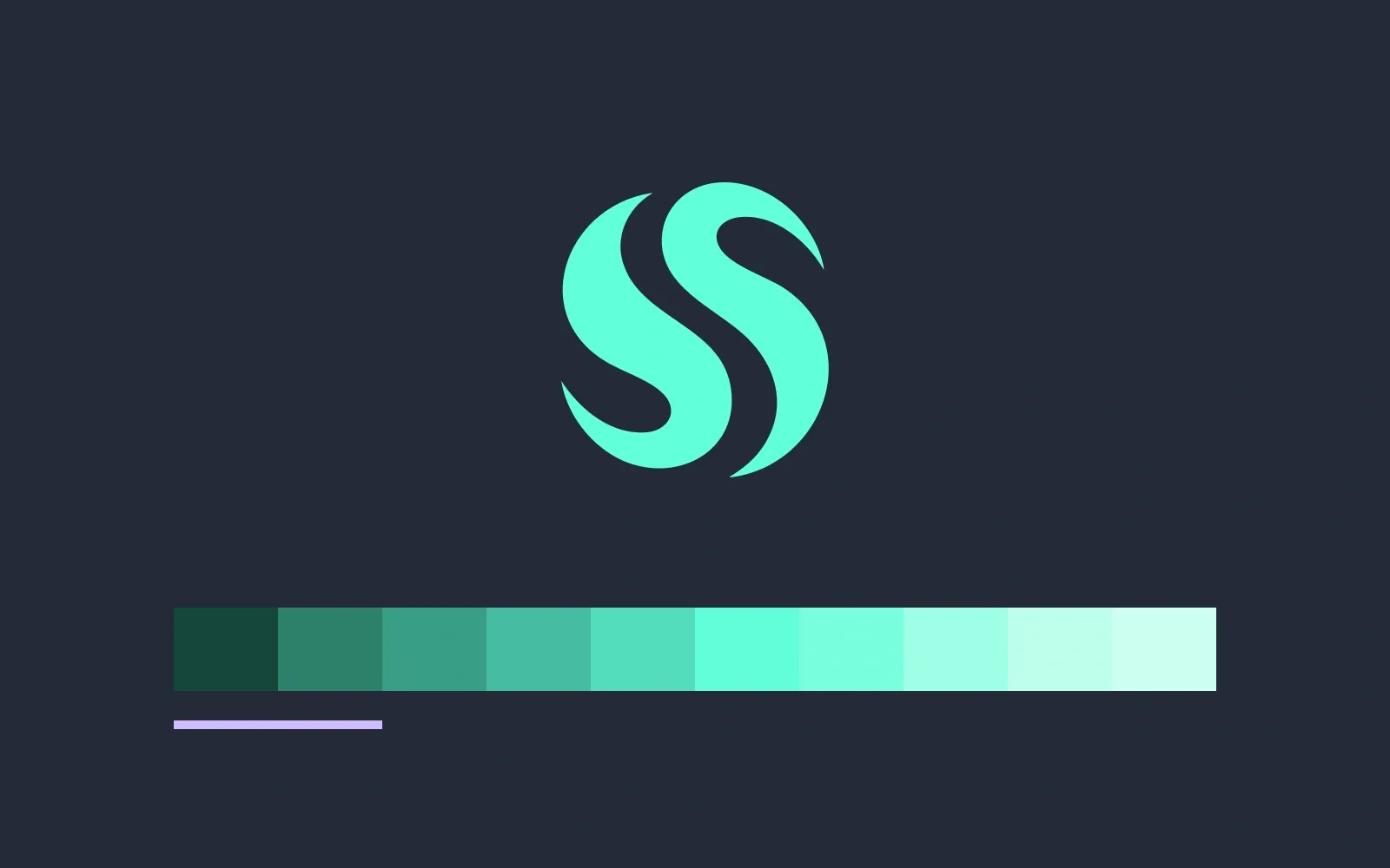
I chose Somny off a long list because it carries sleep and dreaming without spelling either one out. I drew the mark as two strokes that read at once as an S and as two figures turned away from each other. I let the cyan do the identifying on its own and kept the rest of the palette quiet, because a brand sitting behind photographs cannot also compete with them.
Built the system every screen runs on
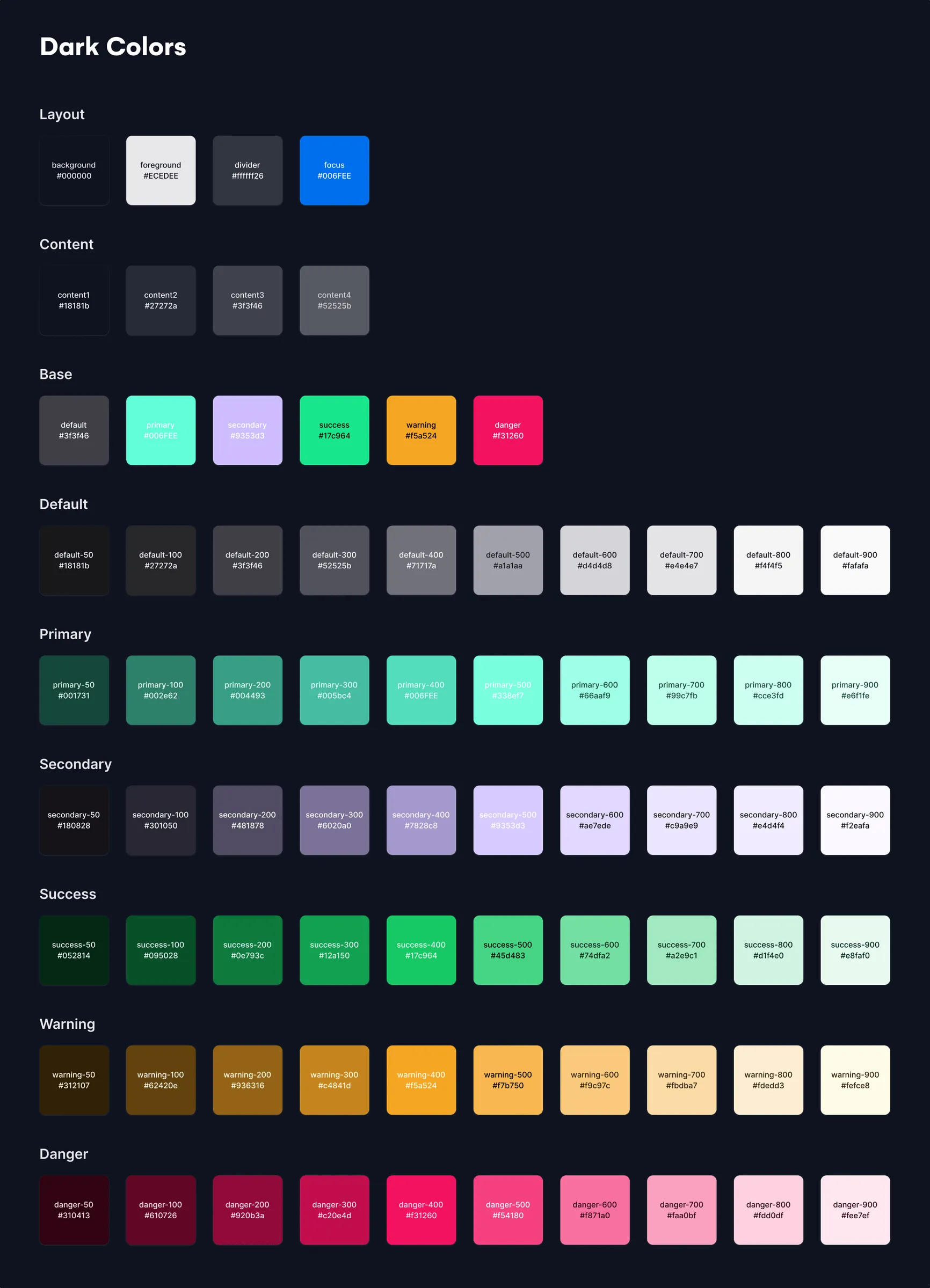
I built Somny’s design system as a semantic layer rather than a pile of one-off styles: 112 color tokens across three themes, 159 text styles, 42 effect styles. Change a token and every screen moves with it, which is how one person kept a whole product looking like one thing. HeroUI gave me the component foundation. The palette, the type, the icon set and a third dark theme it never shipped are mine.
Designed the pages that sell it
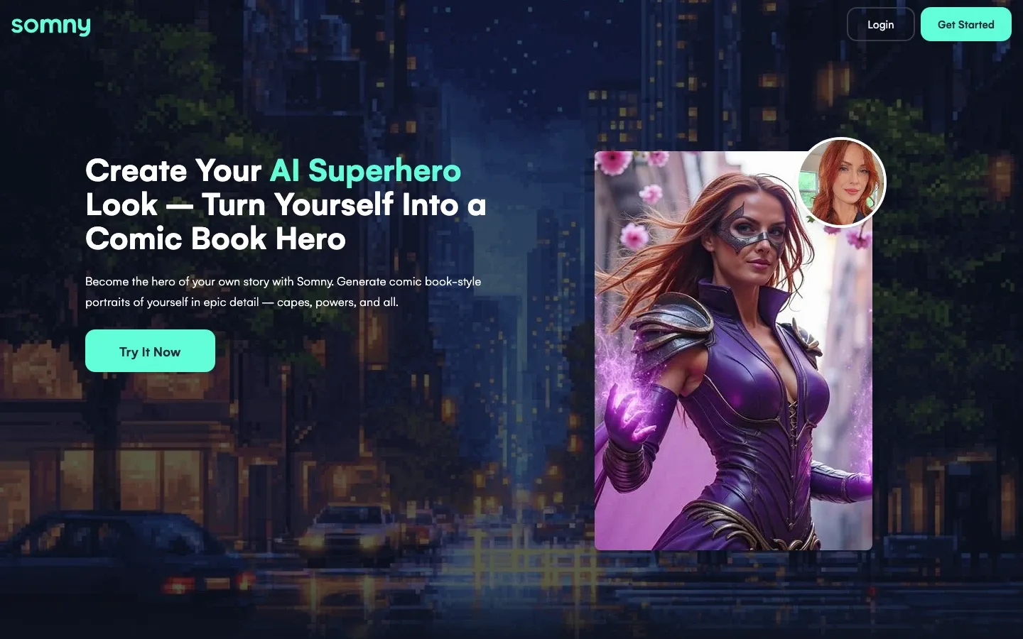
Nineteen marketing pages are live, and each makes the same argument at a different search: put yourself in this particular world. I designed the sections they are built from and wrote the front-end for them, so I compose a new page now rather than draw one from nothing. That is the only reason I got the count to nineteen.